You should be able to do that entirely with CSS. Those buttons have the following CSS classes.
Container: cbTabsStepByStepNav
Previous Container: cbStepByStepLeft
Previous Button: cbTabNavPrevious
Next Container: cbStepByStepRight
Next Button: cbTabNavNext
These currently are just a flex row. With cbStepByStepLeft and cbStepByStepRight consuming 50% width. The below CSS would change this to auto.
Code:
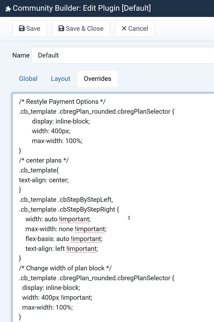
.cb_template .cbStepByStepLeft,
.cb_template .cbStepByStepRight {
width: auto !important;
max-width: none !important;
flex-basis: auto !important;
text-align: left !important;
}
Note I did not test the above and is just an example so you may need to adjust it. You can apply custom CSS to CB using the built in CSS override feature shown below.
www.joomlapolis.com/blog/kyle/18711-template-css-overrides-made-easy
Another trick is you can actually put previous/next buttons within your CB fields themselves. So for example a Custom HTML field. All you need to do is have a button with the Previous Button or Next Button CSS classes above on it and it'll navigate accordingly.
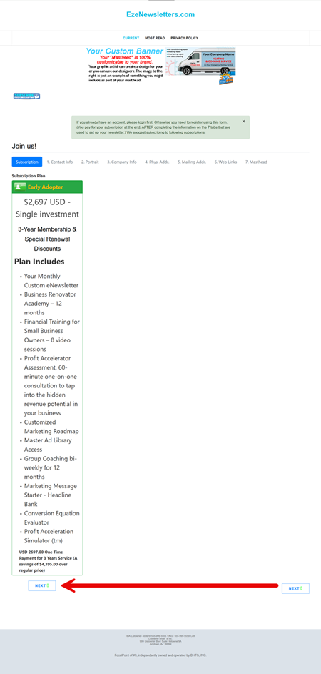
With that said I think your main issue is your plan itself. You're using the rounded display, but you're not applying any width to it with a large description so it's quite squashed. I would recommend applying some width to your plan using CSS so it fits better.

 krileon